Problem statement
During car rentals, our users at Share Now would often face friction once the trip had started. Whether it was locating the fuel card PIN, understanding where and how to return the car, or figuring out how to get support, renters were left to fend for themselves. These gaps in the experience created stress for the users, increased support calls for us and a negative impression overall – amplified during moments when users strongly needed immediate help.
Mission: Make the in-trip rental experience feel effortless by proactively supporting users with relevant guidance at the right moments—so they can focus on driving, not figuring things out.
Hypothesis:
If we provide contextual, timely in-app guidance during rentals—like fueling instructions, return info, and support access—then user satisfaction will increase and support calls will decrease.
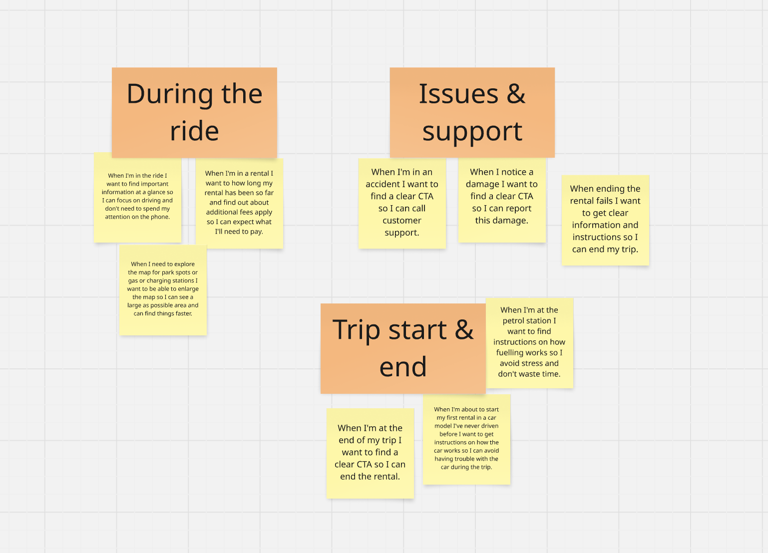
Since the project covered a broad range of topics, we narrowed it down to 3 main goals:
- Improve the visual and informational hierarchy
- Provide more flexible and contextual information
- Make it ready for future changes
Research & Discovery
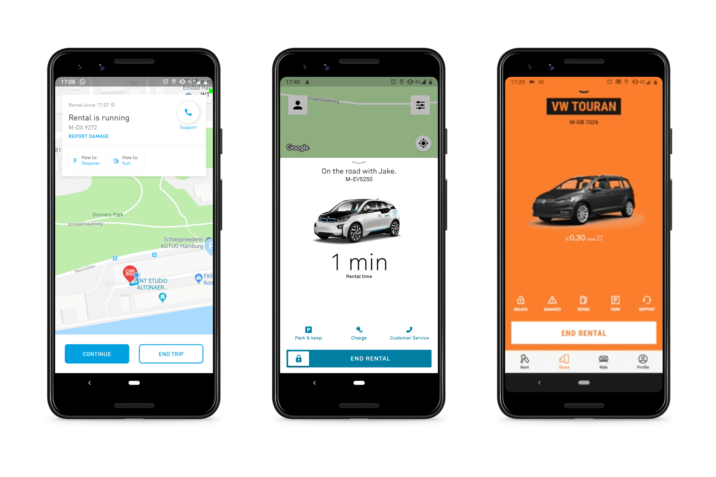
We first started with some field research to understand what our competitors' in-rental experience feels like. For this, we investigated both their apps, but also spent some time renting their cars and doing test rides to put ourselves in the shoes of our users.

Prototyping, Wireframing & Testing
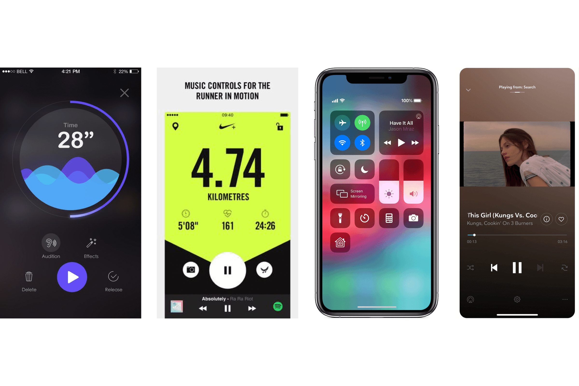
All the pain points we found during the research phase led into the first round of wireframing. For this, we invested some more time into competitor research. This time, we looked specifically outside of the car-sharing space and for analogies like music or running apps as we figured that the basic concept behind media players is not too far from that of a running car rental. Derived from these patterns we worked on wireframes for our rental system.
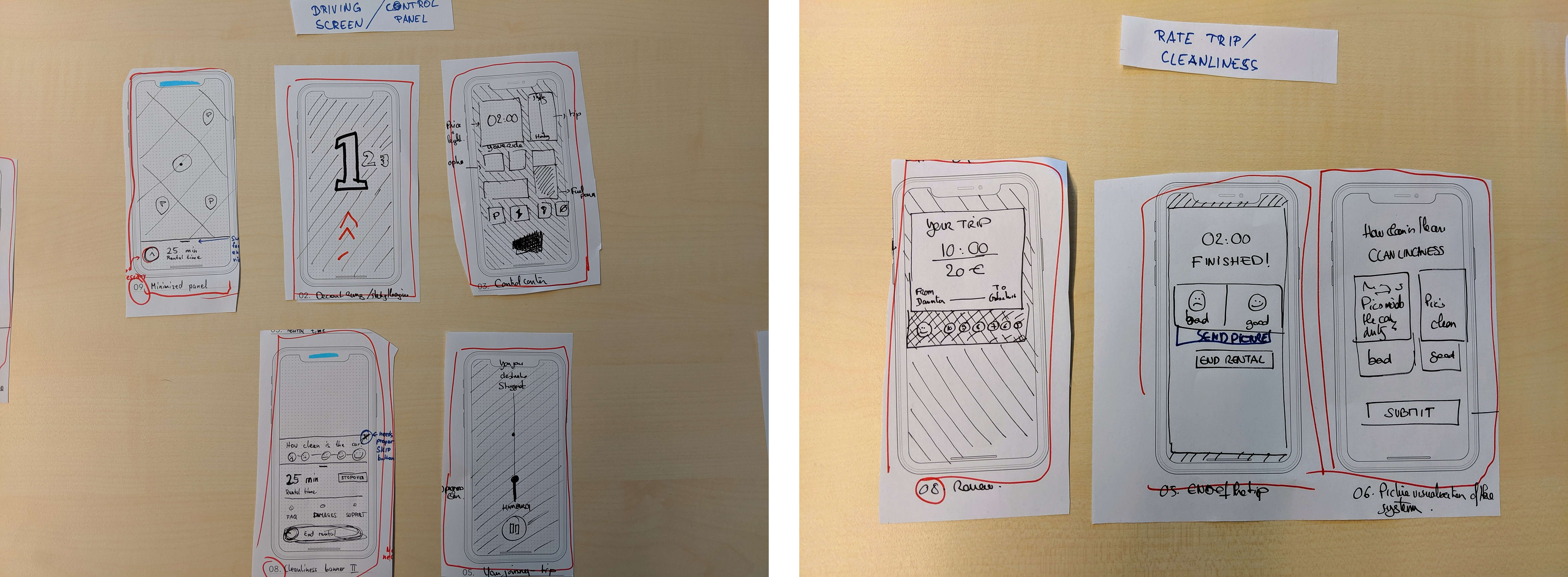
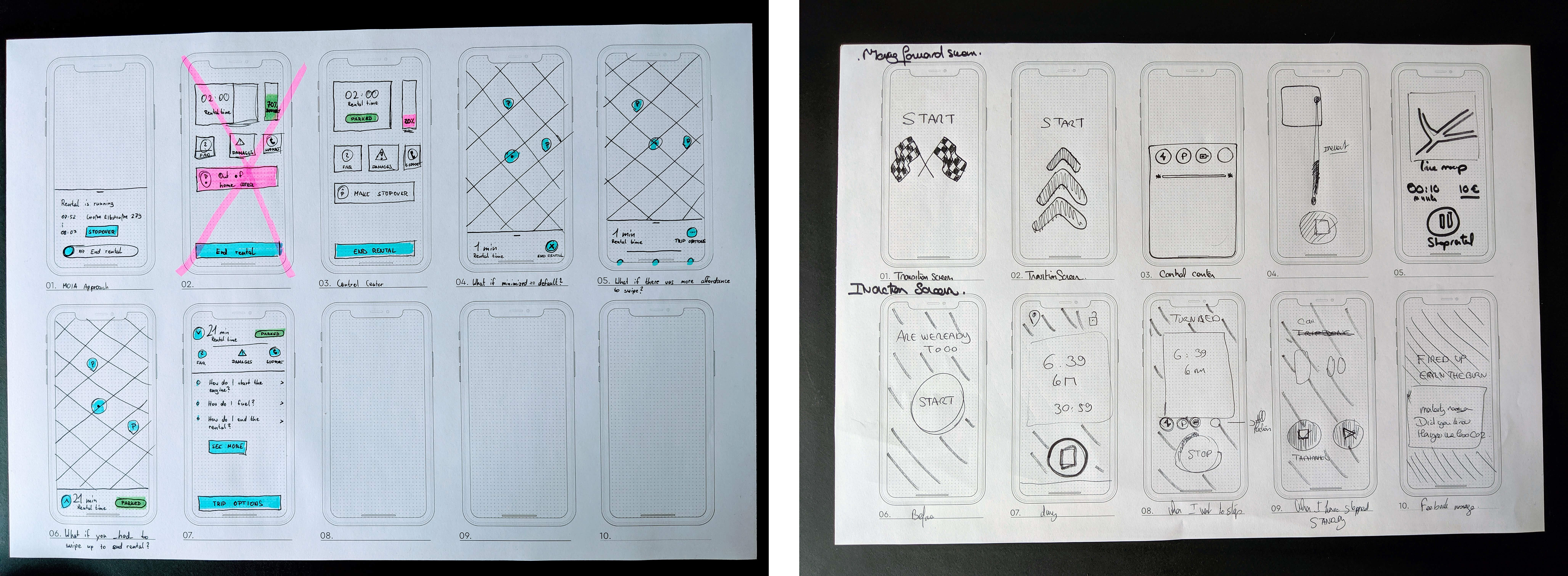
We reviewed these wireframes after about a week and voted on the ideas we liked. These were refined for a second iteration with the goal of ending up two paper prototypes that could be tested in-house with car2go employees.
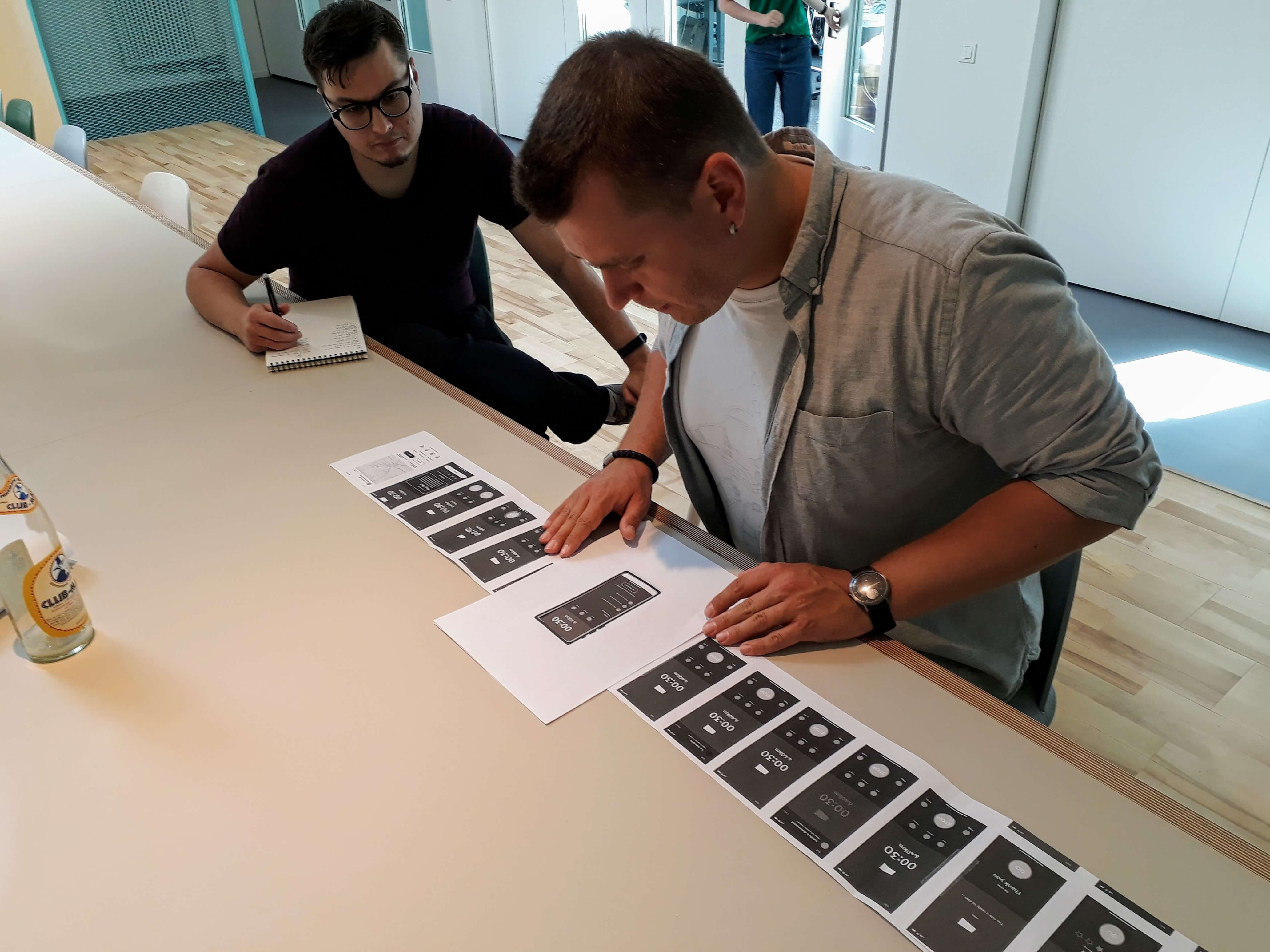
The testings showed that the two concepts we tested had good ideas, but that there was no clear winner. So we went back for a third iteration to merge both concepts into one. The third test with some in-house employees showed us that we were actually on a good way. We kept refining the concept, eventually translated them into final designs and tested them with a real car (and some Wizard of Oz magic..).
Prototype & results
The final prototype consisted of three different parts:
- The rental 'hub' which contains information about the active rental
- The help section which users could enter if they need support with something
- The rating at the end of a trip
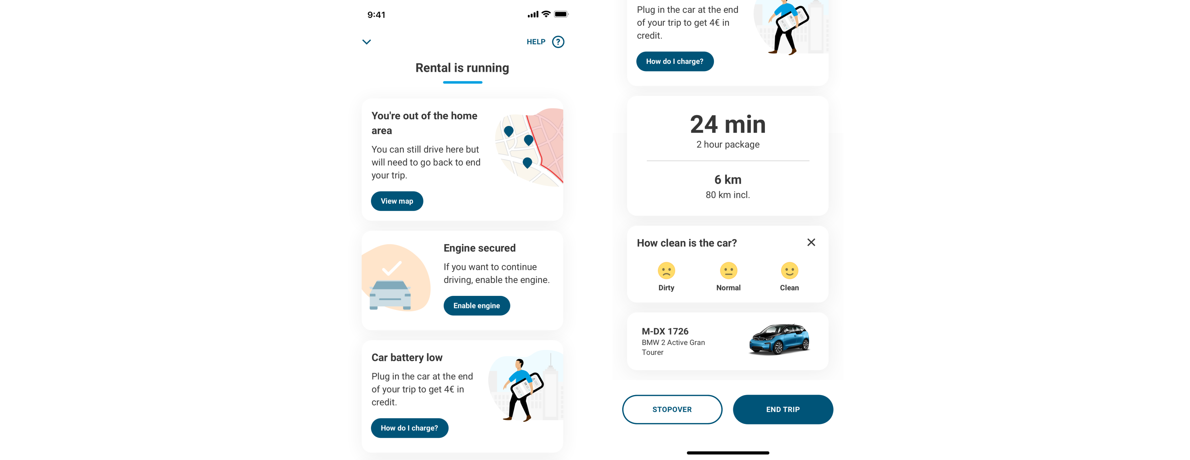
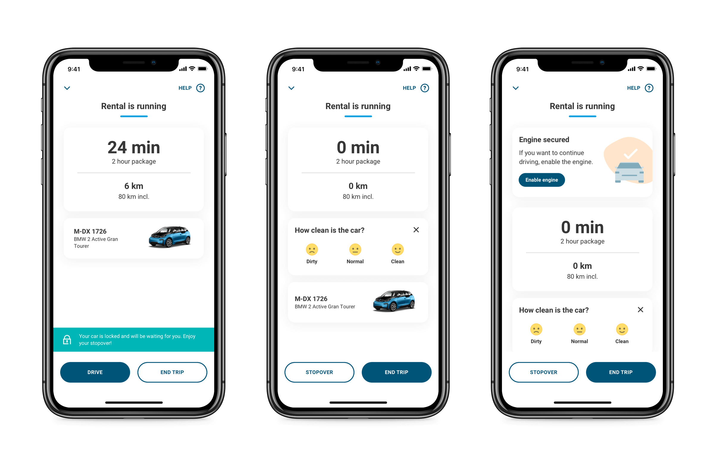
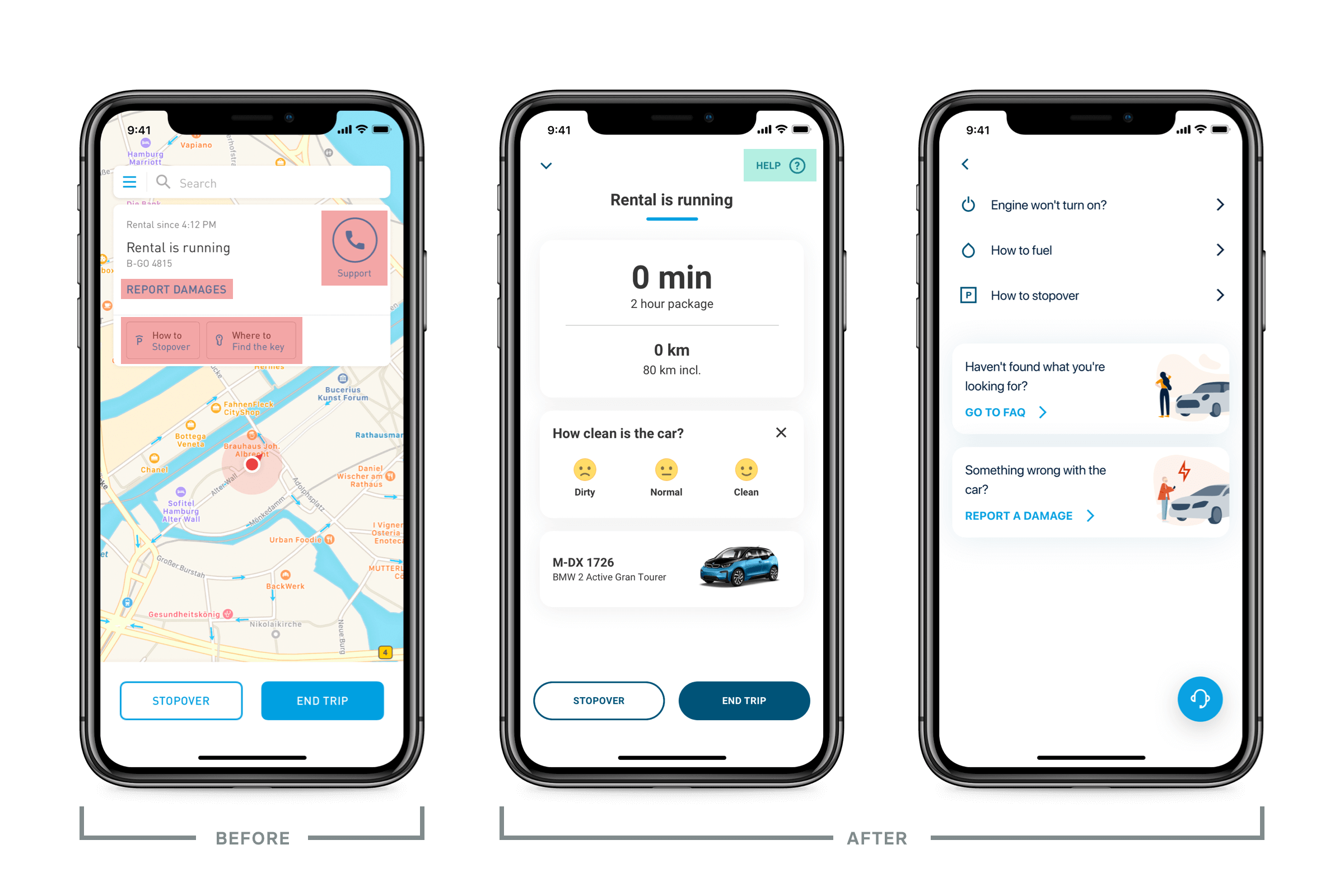
We redesigned the rental screen around a scalable card-based system to surface multiple pieces of contextual information (like rental status, charging instructions, or home area alerts) at once taking inspiration from Google Now. To make space, we moved the map to a full-screen view behind a button, based on earlier research showing it wasn’t essential during the rental. We also introduced a prioritization system for card display, ensuring the most critical info—like being outside the home area—was shown first, while less urgent details followed in a logical, user-focused order.
Help Section
We streamlined the help experience by unifying scattered support resources—like HowTos, FAQs, damage reporting, and customer service—into a single “Help” screen. Based on stakeholder input and user pain points, we focused on surfacing the most common issues during a rental and made them easy to find. The new layout includes quick links and a floating call button for fast access, reducing user confusion and aiming to lower unnecessary support calls.
Trip ratings
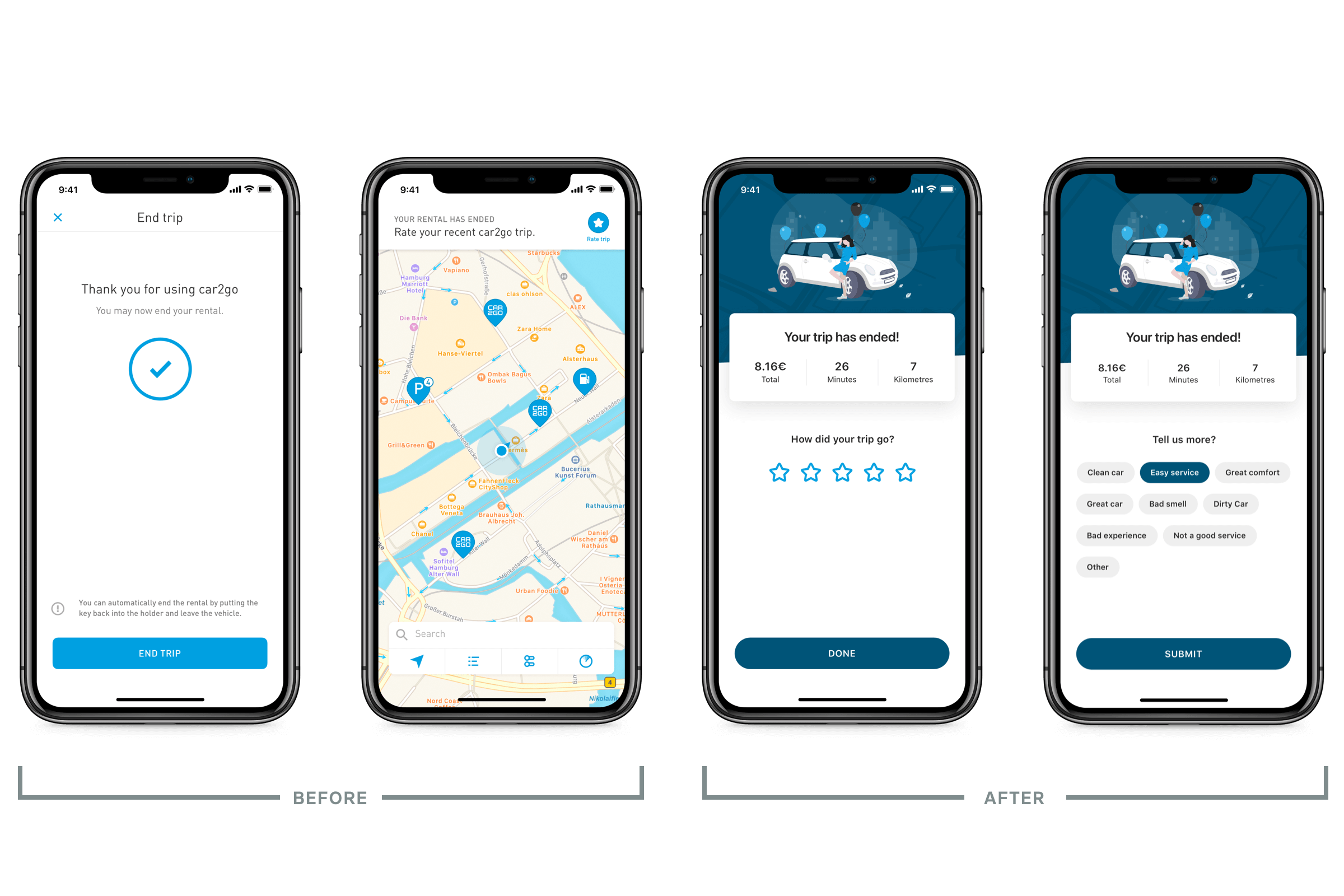
We reworked the offboarding flow to make trip summaries and user ratings more visible and easier to complete. Instead of hiding the rating prompt like before, we integrated it right after the rental ends, aiming to boost engagement and collect more useful feedback. The new system used smart cues based on the star rating to reduce user effort while still allowing free-text input. Although this part never shipped, it laid the groundwork for future experiments around user feedback and potential service insights.
Outcomes
Due to time constraints, the full concept never saw the light of day. However, parts of it were successfully implemented, like the help screen and the pricing and stats at the end of the ride.
This project was pivotal for me in refining my design process. I went deeper into competitor research, including indirect competitors, and employed interviews and testing with in-house staff, all of which helped strengthen my overall concept and design approach. Even though only a small part of the concept was implemented, it significantly improved my skills.